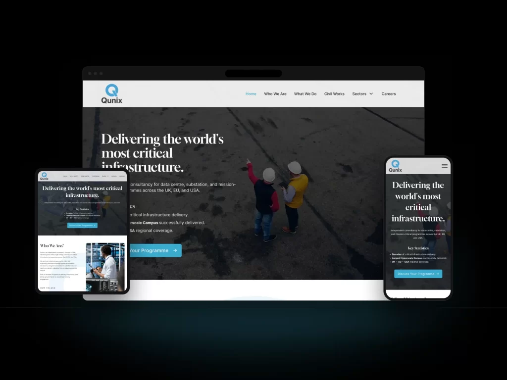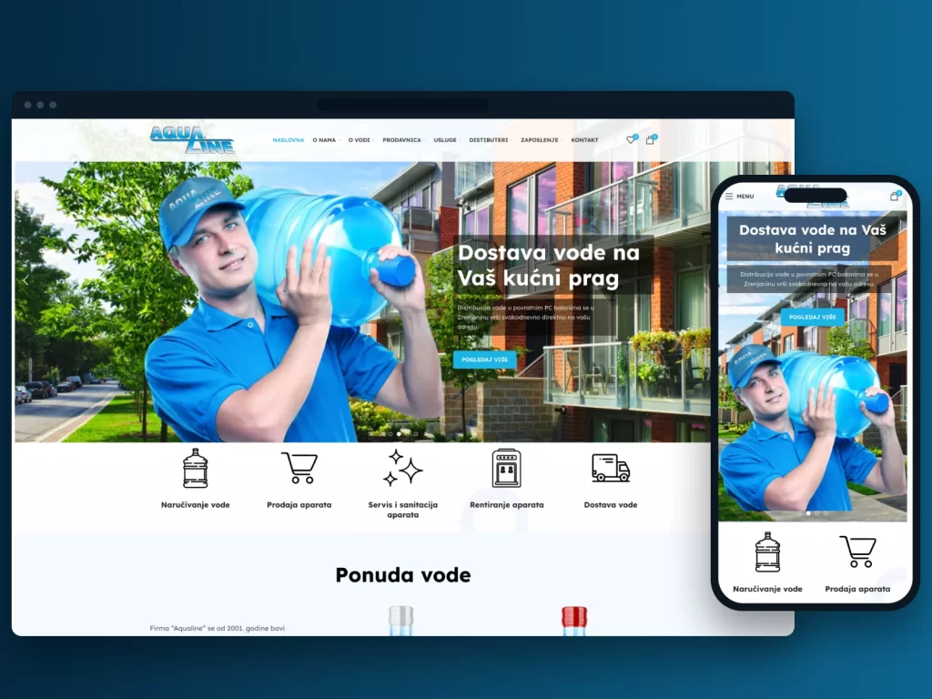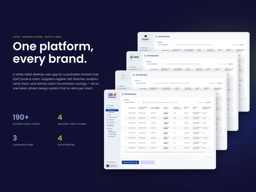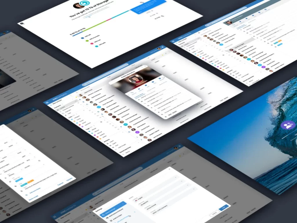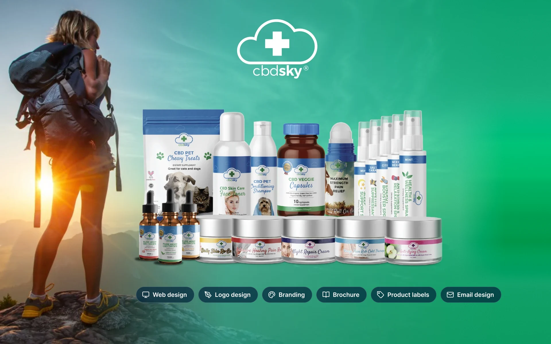
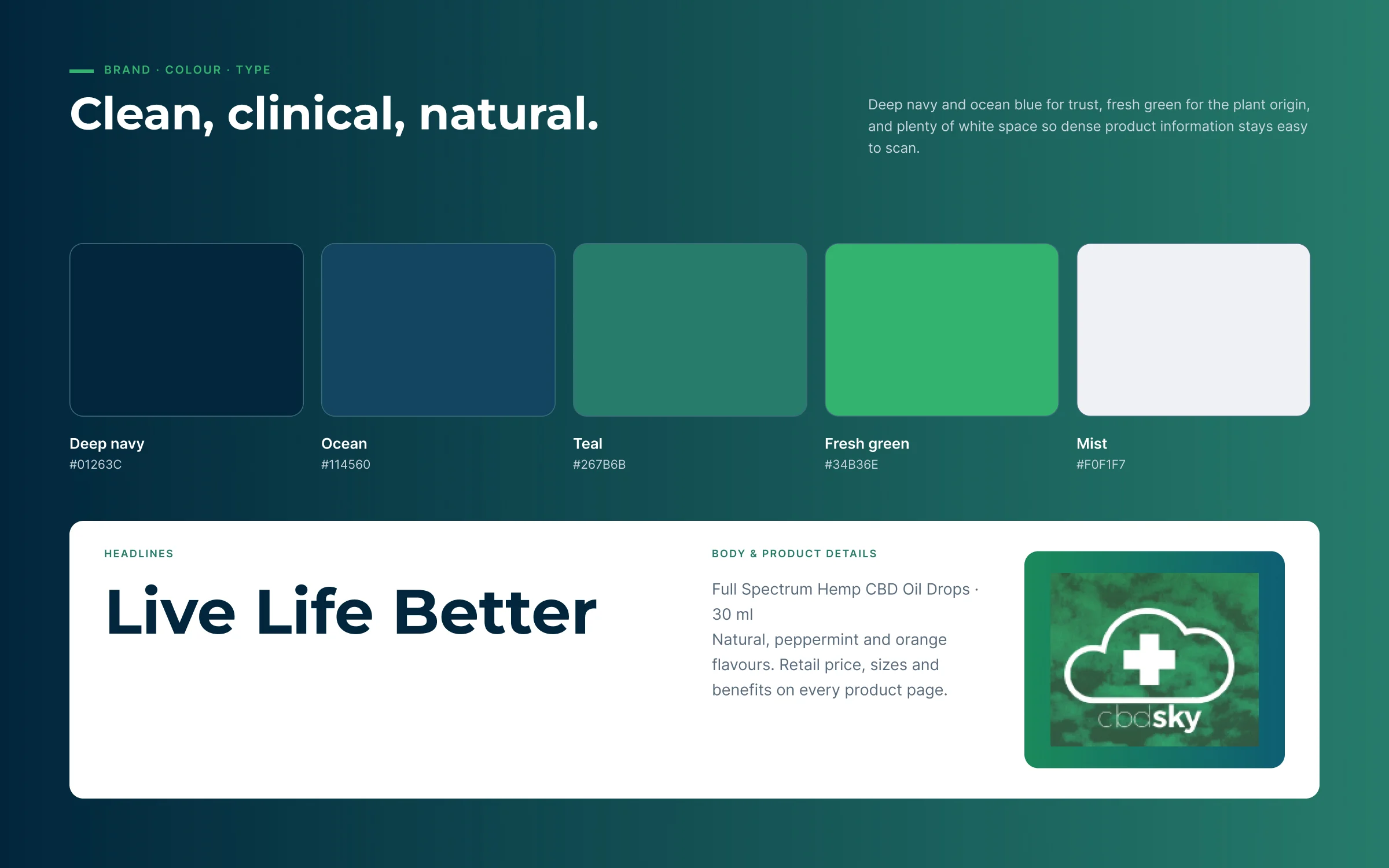
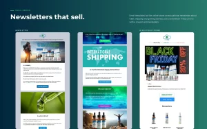
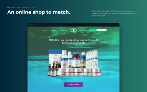
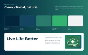
A US brand of THC-free CBD cosmetics and wellness products needed one consistent look across everything a customer touches: the product labels, the printed catalogue used by sales partners, the email newsletters and the online shop.
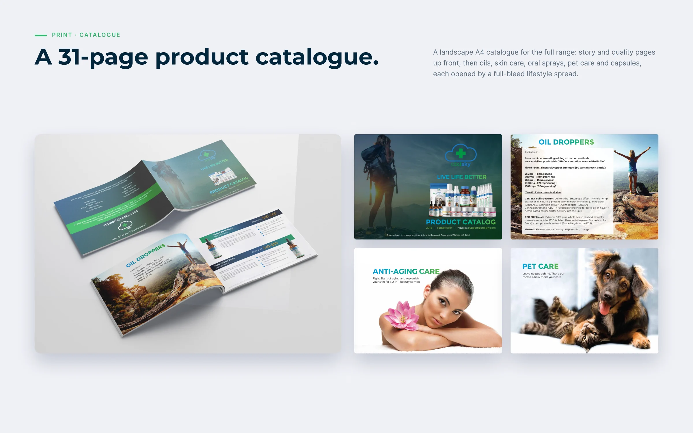
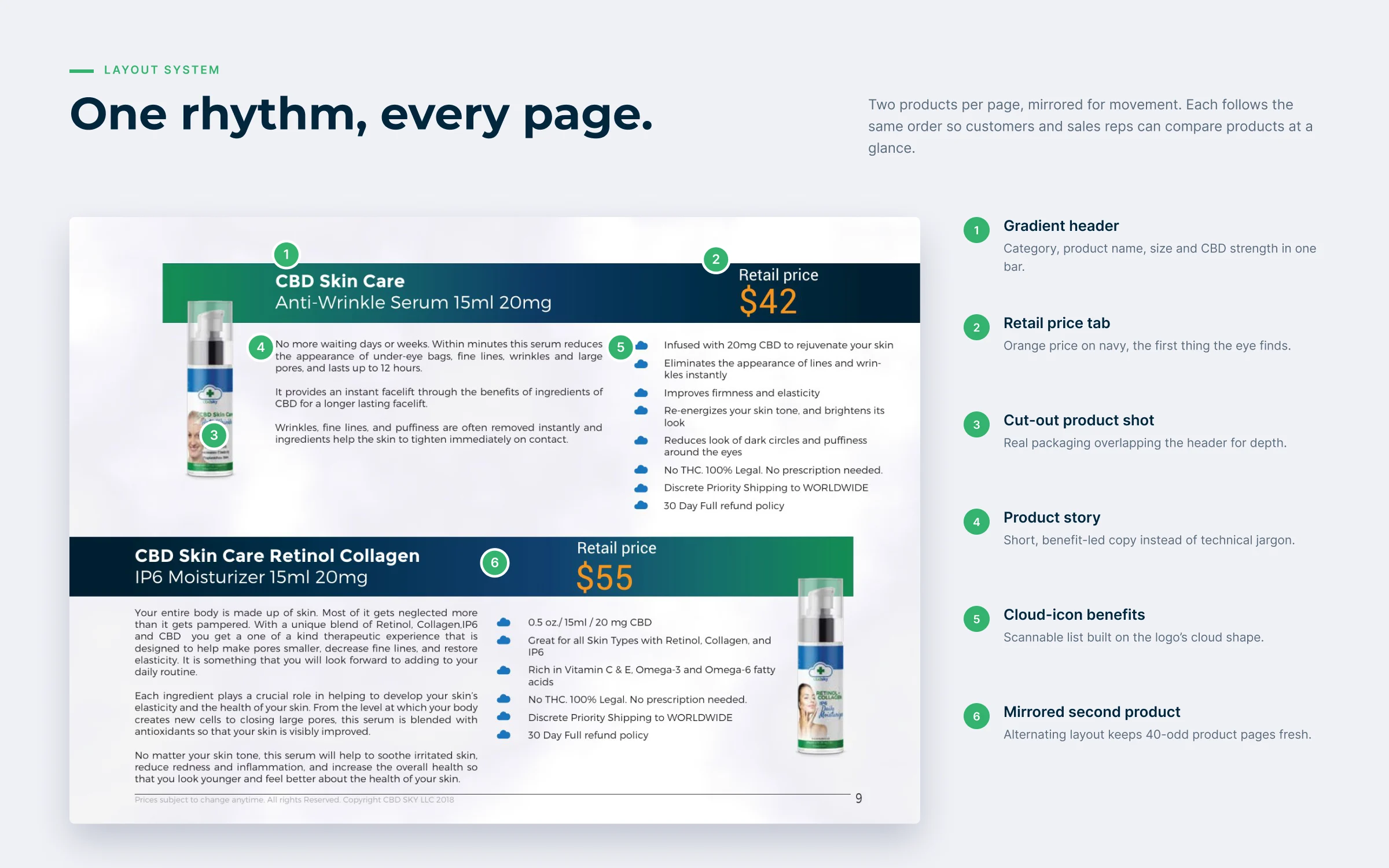
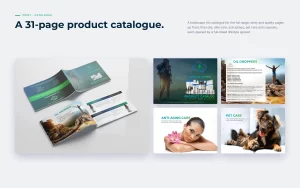
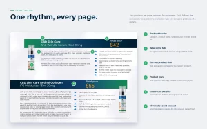
The 31-page landscape catalogue opens with the brand story and quality process, then walks through oil drops, skin care, oral sprays, pet care and capsules. Each category starts with a full-bleed lifestyle spread, and every product page follows the same rhythm: gradient header with name and strength, an orange price tab, a cut-out product shot, short benefit-led copy and a cloud-icon benefit list taken from the logo.
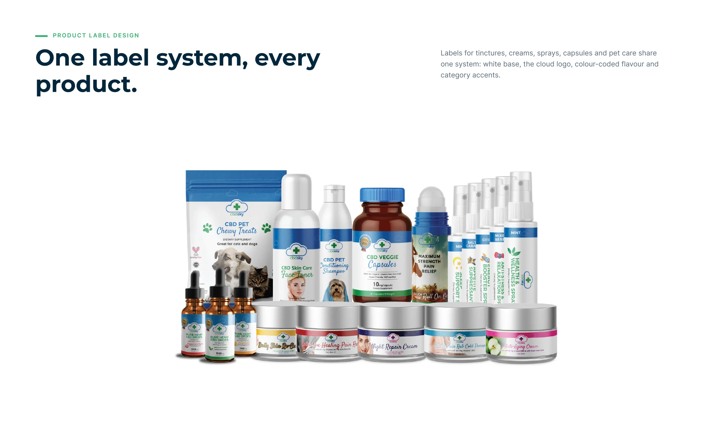
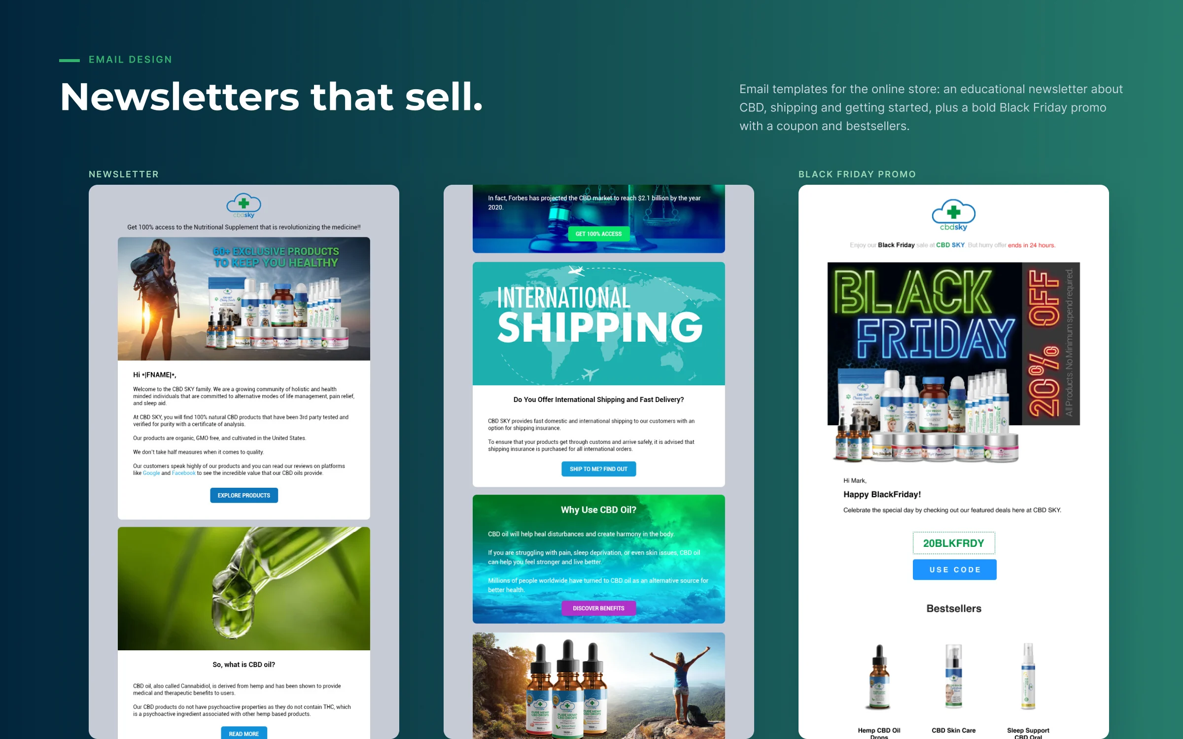
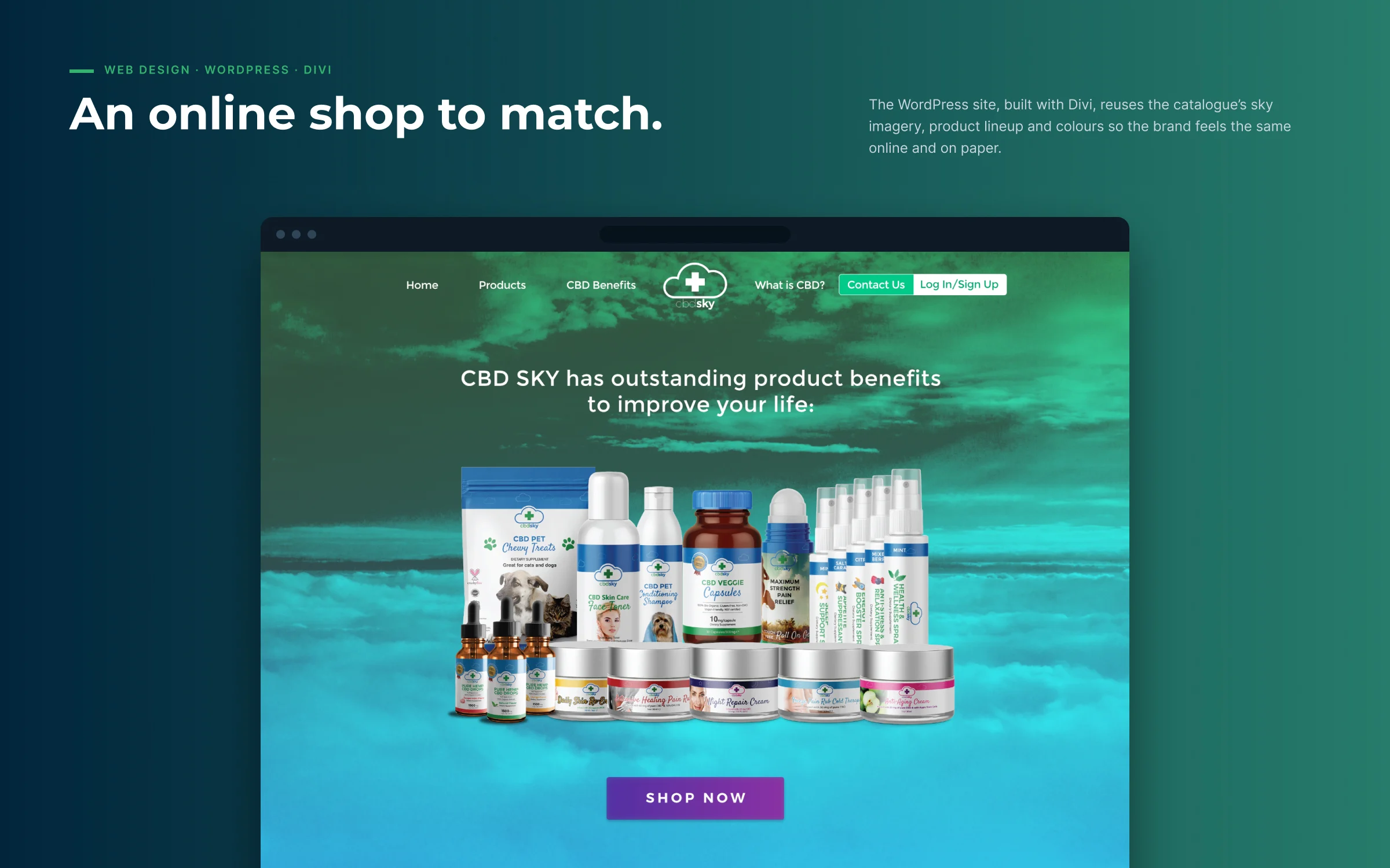
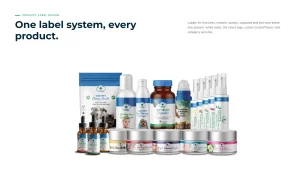
The same system runs through the product labels, the newsletter and Black Friday emails, and the WordPress site built with Divi, so the brand feels identical on a shelf, in an inbox and online.