
What Is This All About?
ACMEsuite is a software suite for communication & collaboration solutions that enables users to create a business environment for various organizations.
Consists of different applications for enterprise environment:
Similar suite to Google Workspace
This software suite is intended for
Need to look professional, in a business tone.
Note: In this case study I will focus only on global design system across all apps.
In this section I will include notes about design rationale, that will be applicable across all the others apps that are part of the same suite.
Why Was This Necessary?
I met with the Founders, Marketing team and Lead Developers and we had the workshop/conference for future apps development. At this point, we only had the open source apps that we used as a base. The idea behind this suite was to use open source applications, redesign them, customise them and ship to the clients for the business use.“In order to start with designing various apps from the same suite, we need to create design system and components for the entire suite that will be reused throughout the apps.”
Founders decided to use “design like Google apps”
So, Google Material Design was taken as a base for our apps and therefore for components as well.
Sometimes in some apps, founders requested to use the same layout like the original open source app, instead of Google apps layout.
Who Was This For?
This suite is intended for:
Based on the audience I’ve created proto-personas that would help me dive deeper into empathetic understanding of the user’s needs.
Who Did What?
In this team there were about 60 people (developers, marketing, QA, designers….). We’ve all been working remotely, from all around the globe: Germany, Swiss, Belarus, Ukraine, Serbia, India, UAE and others.
There were only two designers on the team. My role was Lead UI/UX designer, and my colleague Dmitry was also a UI/UX designer. We’ve been working on various tasks interchangeably.
The collaboration between us was through daily meetings, video calls, screensharing and more.
What Did I Have To Work With?
Scope for this project was:
We didn’t have any strict timelines, but the task was supposed to be done in reasonable time.
What Did I Actually Do?
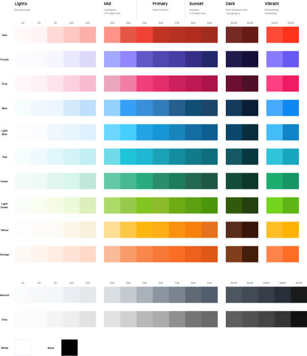
We have created the entire color palette based on Google’s material colors.
Color usage (business, professional, solid):
Basic palette: Primary: Blue600 Secondary: Neutral600
Other tones: Lights – Backgrounds Mid tones – Highlights Primary – Main content Sunset – Headers Dark tones – Dark backgrounds, Typography
Pink – only marketing, Vibrant – S100, S200 – marketing, attention Orange – Illustrations
We’ve created the variable names for each color from the palette, and we used it in Sketch as color components.
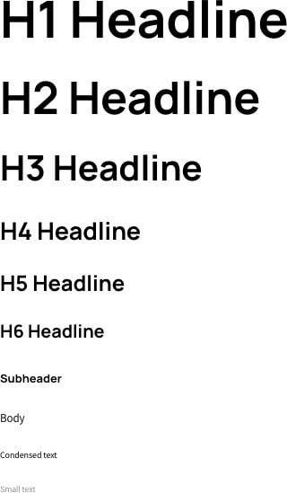
We’ve been using Manrope for the Headlines 1-6 and Source Sans Pro for the rest of the elements.
Manrope/Source Sans Pro font combination is similar in style with Google apps font’s combination (Product sans/Roboto) at that time. So, that’s why we decided to go with this combination. Founders approved it.
The Material Design type scale includes a range of contrasting styles that support the needs of your product and its content.
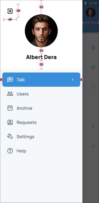
All components align to an 8dp square baseline grid for mobile, tablet, and desktop. Like google material design system
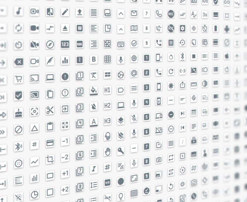
Most of the work on icons was done by Dmitry, my colleague designer. I did some minor parts.
Icons are created as a components in 24x24px size in Sketch, so we can easily switch the icons.
We have designed the custom icons set with over 900 custom icons.
It is based on Google material style.
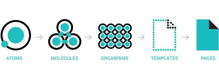
We’ve been using Atomic Design Methodology in components. The components started from the most basic elements – atoms, and then were built and grouped into more complex structures like templates and pages
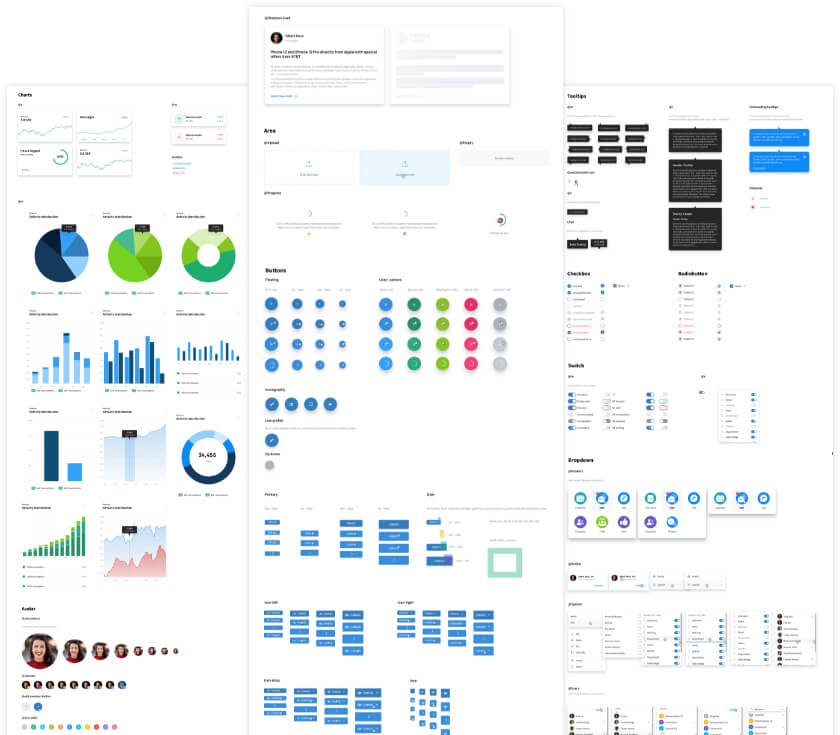
We both worked on components. First we created the most common components like buttons, text fields, drop downs, charts, empty states, avatars, tooltips and more.
We’ve been adding new components up to date, that is iterative process.
The whole time we’ve been working closely with founders and showing them the progress regularly. If there were some changes, suggestions, ideas, we applied them.
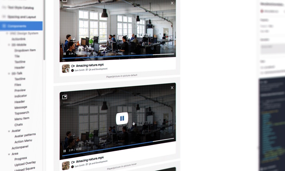
After the approval of the components we’ve import them to Zeplin for developers so they can reuse them.
After that, we also integrated Storybook with the Zeplin, so developers can code components once, and then it could be reused a number of times amongst the applications.
How Did Things Turn Out?
We have created the set of 3534 components so far. The work on components is inexhaustible. Each step of the flow had the testing and iterations phase.
The journey I’ve had in the last 5 years was the most exciting time in my career. I’ve been working with the international team of 60 people, all from different countries, cultures, timezones, and departments.
I’ve expanded my Sketch skills, and created a huge library of components. This is by far the biggest library I have ever worked on.
We have released about 20 apps, addons, and extensions. I’m very grateful for the opportunity to have been able to work with the team and founders very closely.
Founders were very happy with the results.
The client’s feedback and instructions were very helpful.

I’d like to hear about your great idea!
Just drop me a message, and we can discuss how to turn your idea into reality!
Hundreds of clients are satisfied with the value I provide them with in their projects.
